A hospital website in the language its patients actually think in.
Agarwal Nursing Home is a multi-speciality hospital in Narnaul, Haryana, caring for families across the district for over three decades.

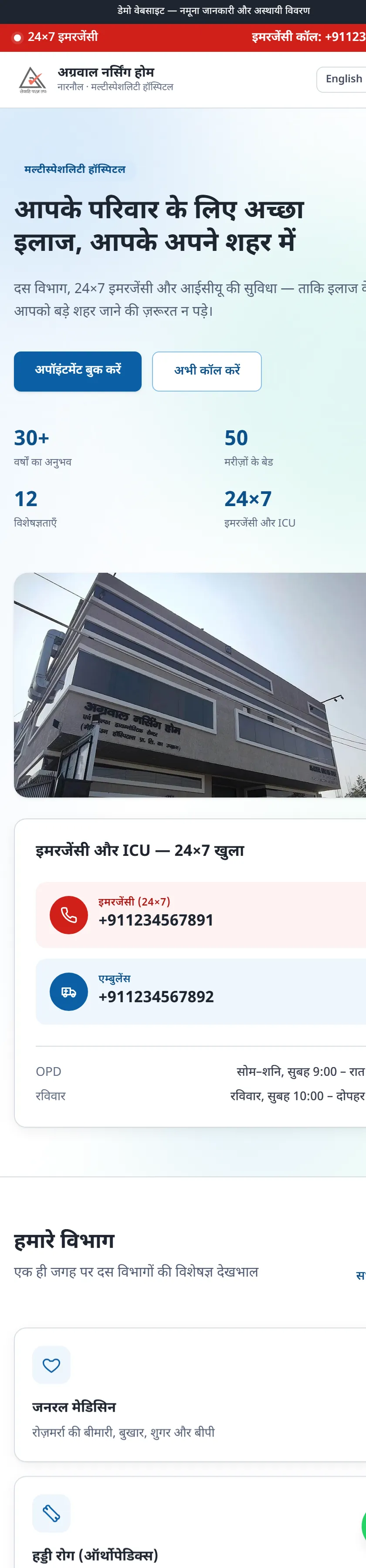
- 30+
- Years of care
- 50
- Beds
- 10
- Departments
- 24×7
- Emergency & ICU
Figures as published on the hospital's own site.
The problem
A hospital with thirty years of standing in the district had no website at all. Families deciding where to take a relative at two in the morning had nothing to look at — no departments, no doctors, no emergency number they could tap.
Meanwhile bigger hospitals sixty kilometres away in Rewari and Gurugram did have websites. When a worried family searched, those were what came up. A local hospital with the beds, the ICU and the specialists was invisible at exactly the moment it mattered most.
The insight that shaped everything
We spent time looking at how people in Narnaul actually search. The answer was blunt: they search, read and decide in Hindi. A polished English-only hospital site would have looked impressive to the management and been near-useless to half the families it was meant to serve.
So we did not build an English site with a Hindi translation bolted on. We built a Hindi site, and put English one tap away.
That single decision drove the typography, the line lengths, the labels on every button and the way each department is described. Devanagari needs more vertical room than Latin script and breaks differently across lines — get that wrong and the page looks cramped and amateurish, whatever the design.
What we built
Emergency, above everything
A red bar sits at the very top of every single screen with the 24×7 emergency and ambulance numbers, tappable. Nobody in a genuine emergency should have to scroll, read a menu, or find a "Contact" page. It is the first thing rendered and the first thing you see.
Ten departments, in plain language
Medicine, surgery, orthopaedics, gynaecology, paediatrics and the rest — each written the way a patient would describe their problem, not the way a doctor would classify it. Somebody with a broken wrist searches for a bone doctor, not for "orthopaedic trauma services".
The things families actually ask first
- Doctors — who they are, what they specialise in, when they sit
- OPD timings — plainly stated, not buried in a PDF
- Health-check packages — what is included and what it costs
- Cashless insurance — which providers are accepted, so nobody arrives and finds out the hard way
- ICU and bed availability — the questions people ring up about anyway
Built for a phone on patchy data
Almost every visitor arrives on a mid-range Android over mobile data that comes and goes. So the site is deliberately lightweight: compressed images, no heavy frameworks, and text that renders before the pictures finish. Buttons are thumb-sized. Calling the hospital is never more than one tap from anywhere on the site.
How it was delivered
The entire site was designed, built and put online before the hospital had paid anything. They opened a link on their own phone, showed it to whoever they wanted, and decided from there. That is how we start every project — see how the packages work.
What it changes
The hospital now has something to send. A WhatsApp forward, a Google search, a number on a prescription slip — each of them now leads to a page that explains what the hospital does, who works there, and how to reach it in an emergency. For a local business, that shift from invisible to findable is the whole game.
If you run a hospital or clinic, the same thinking is set out in our guide to hospital and clinic website design.
More work
Run a hospital or clinic?
We'll build yours the same way — free demo first, in 24 hours, no advance.